You've crafted the perfect email, designed a stunning landing page, or posted a viral-worthy video. Yet, the engagement is flat, and conversions are nowhere to be found. This common frustration for marketers and creators often points to one critical element: the call to action (CTA). A weak CTA like "Click Here" is a dead end for your customer's journey, leaving them confused and your strategic efforts wasted. The right CTA, however, can turn that final step into a powerful conversion magnet.
This article provides a strategic breakdown of high-converting call to action examples you can implement immediately. We will dissect 12 specific CTAs, from the simple "Sign Up" to the aspirational "Start Your Journey," analyzing the psychology that makes them effective. You'll learn not just what to write, but why it works and how to adapt these principles for your own emails, websites, and social media campaigns. Let's explore the examples that will elevate your marketing and drive measurable results.
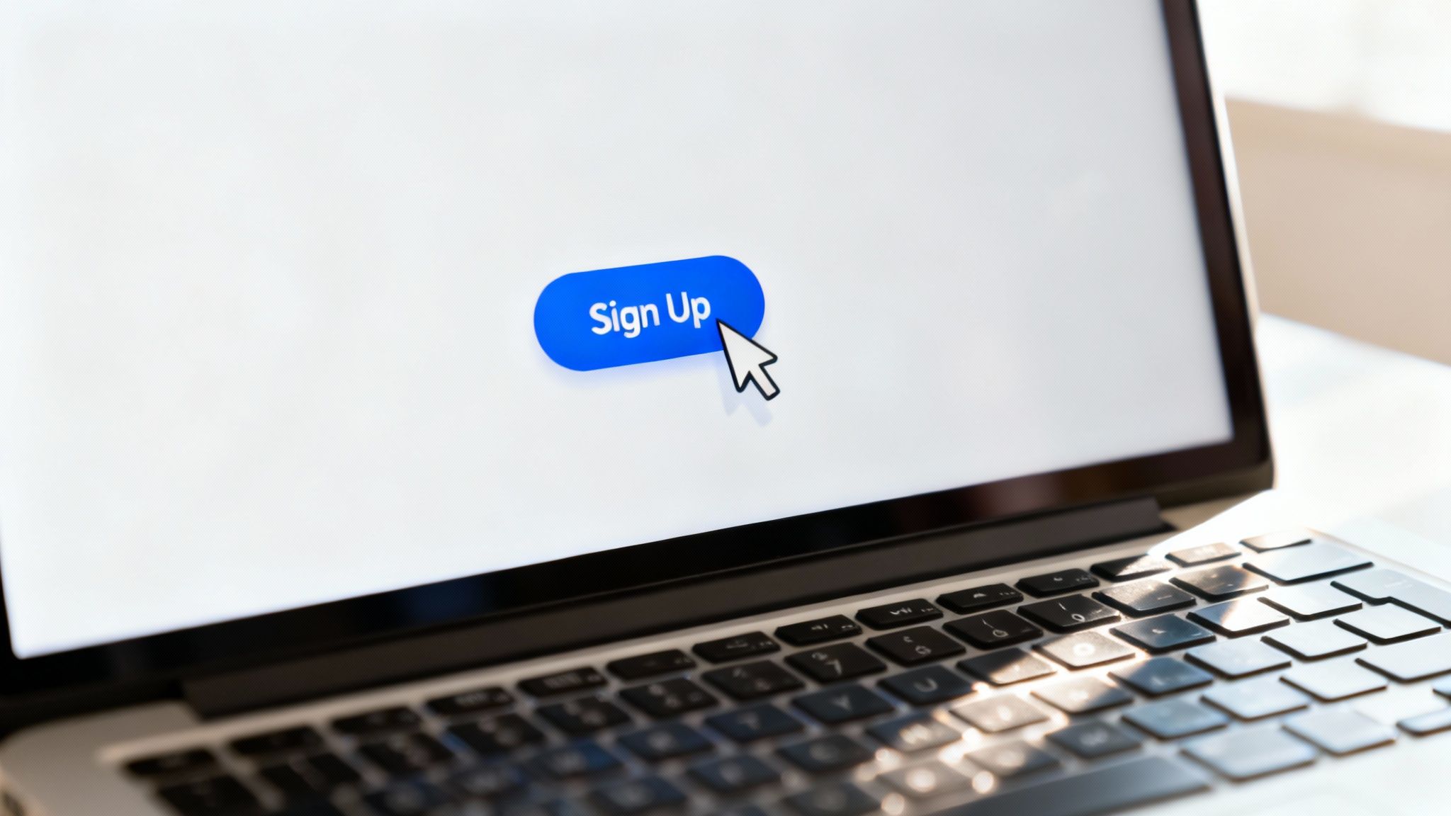
1. Sign Up
The "Sign Up" call to action is a foundational element in digital marketing. As a direct invitation for a user to create an account or register for a service, this CTA is effective because it's universally understood and sets clear expectations. For creators and marketers, its power lies in its simplicity; it represents a low-commitment first step in the customer journey, making it a reliable choice for list building and user acquisition.
Strategic Breakdown
Companies like Netflix and Slack use "Sign Up" as the culmination of their value proposition. For Netflix, it's the gateway to "Unlimited movies, TV shows, and more." For Slack, it's the path to a "smarter way to work." The surrounding copy sells the outcome, making the CTA the logical next step to achieving that benefit. For digital marketers and startups, this means the goal is to frame signing up as an opportunity, not a task.
Actionable Takeaways
To make your "Sign Up" CTA more effective, focus on the context.
- Frame the Value: Position a clear benefit statement directly above or beside the button. For instance, "Join 50,000+ marketers and get weekly insights."
- Create Visual Contrast: The button's color should stand out, drawing the user's eye directly to the desired action.
- Simplify the Process: Ensure the sign-up process is frictionless. The fewer fields required, the higher the conversion rate.
- Provide Reassurance: Use microcopy near the button, like "No credit card required" or "Free forever," to alleviate common user anxieties. For more advanced techniques, explore these copywriting tips for beginners to enhance your CTA copy.
2. Learn More
The "Learn More" call to action is a low-pressure invitation for users to explore a topic or service in greater detail. For content creators and agencies, it’s an essential CTA for the top of the marketing funnel, where the primary goal is education and trust-building rather than immediate conversion. This approach respects the user's journey, allowing them to gather information at their own pace without feeling forced into a commitment.
Strategic Breakdown
Companies like Apple and HubSpot master the "Learn More" CTA by linking it to meticulously crafted, benefit-driven content. On an Apple product page, clicking "Learn More" doesn't lead to a dry spec sheet; it takes you to an immersive experience detailing the product's value. The strategy is to satisfy curiosity with high-quality information, guiding the user from initial interest to a deeper level of consideration. The CTA acts as a gateway to content that sells the solution.
Actionable Takeaways
To make your "Learn More" CTA a powerful discovery tool, focus on the destination.
- Link to High-Value Content: Ensure the CTA leads to well-organized content like feature breakdowns or case studies that answer potential questions.
- Set Clear Expectations: Use surrounding copy to hint at what the user will discover. "See how it works" or "Explore all features" is more specific than a standalone button.
- Use a Compelling Lead-In: Place the button directly after a strong headline or a compelling intro that piques the user's curiosity.
- Segment Your Audience: On a page with multiple services, use distinct "Learn More" CTAs to track user interest and guide them down personalized funnels.
3. Get Started
The "Get Started" call to action is a powerful, low-friction invitation that frames the next step as the beginning of a positive journey. It feels less like a binding commitment than "Sign Up" and more like an exploratory first step. This motivational language is incredibly effective for SaaS platforms, online courses, and interactive services where the value is revealed through user participation and onboarding. It implies progress and immediate engagement, making it a favorite for startups and freelancers.
Strategic Breakdown
Companies like Canva and Duolingo master the "Get Started" CTA by linking it directly to an immediate, value-driven experience. The user isn’t just signing up; they are instantly starting a design or beginning a language lesson. This approach works best when the action leads to a seamless and guided onboarding process. The CTA sets an expectation of action and momentum, which the product then fulfills, creating a satisfying initial user interaction.
Actionable Takeaways
To maximize the impact of your "Get Started" CTA, focus on fulfilling its promise of immediate progress.
- Promise an Outcome: Surround the button with copy that clearly states what the user will begin doing. For example, "Start creating your first design in 60 seconds."
- Ensure a Smooth Onboarding: The click must lead to an intuitive, guided experience. Use progress bars or checklists to reinforce the sense of moving forward.
- Leverage Freemium Models: This CTA is a natural fit for free trials or freemium products, encouraging exploration without the pressure of a purchase decision.
- Add Social Proof: Position testimonials or user counts nearby, like "Join 2 million learners," to build trust and validate the decision to begin.
4. Buy Now
The "Buy Now" call to action is the definitive final step in the ecommerce conversion funnel. It's an unambiguous, high-intent command that signals the transition from browsing to purchasing. Unlike softer CTAs like "Add to Cart," "Buy Now" communicates urgency and immediacy, catering to decisive customers ready to complete their transaction without delay. For any content creator or brand selling products, its power lies in its directness, removing friction at the peak of purchasing intent.
Strategic Breakdown
Retail giants like Amazon have mastered the "Buy Now" button by making it a cornerstone of their one-click checkout experience. The strategy isn't just about the button's text; it's about the entire ecosystem built around it. The CTA is placed prominently, often in a high-contrast color, and surrounded by trust signals like customer ratings, delivery information, and secure transaction badges. This creates an environment where the click feels both easy and safe.
Actionable Takeaways
To maximize the impact of your "Buy Now" CTA, focus on building trust and minimizing friction.
- Create Visual Urgency: Use a bold, contrasting color for the button (like orange or red) that makes it the most prominent element on the page.
- Surround with Trust Signals: Place security logos (SSL certificates), money-back guarantees, and payment method icons near the button to reassure users.
- Streamline the Checkout: Ensure the post-click experience is seamless. A complicated or lengthy checkout process will quickly lead to abandoned carts.
- Provide Reassurance: Reinforce the purchase decision with microcopy. A simple phrase like "Secure Checkout" or "Easy Returns" can make all the difference. For more inspiration, you can streamline your content strategy with these social media marketing templates.
5. Claim Your Free Trial
The "Claim Your Free Trial" call to action is a powerful, risk-reversal tool that excels for SaaS, software, and premium services. It masterfully combines the psychological pull of ownership ("Claim") with the low-risk allure of a free preview. This CTA encourages users to experience a product's value firsthand before making a financial commitment, making it one of the most effective call to action examples for driving high-quality sign-ups for digital marketers and startups.

Strategic Breakdown
Companies like Asana and Adobe use this CTA to bridge the gap between user curiosity and conversion. The word "Claim" subtly implies the user is taking possession of something valuable that is rightfully theirs, creating a sense of ownership even before the trial begins. This isn't just a "start"; it's an "acquisition." The surrounding copy focuses on the immediate benefits and core features accessible during the trial, turning the CTA into a gateway for experiencing the product's solution.
Actionable Takeaways
To maximize the impact of your "Claim Your Free Trial" CTA, focus on removing friction and clarifying value.
- Specify the Duration: Be transparent about the trial length directly on or near the button (e.g., "Claim Your 14-Day Free Trial").
- Remove Payment Barriers: If possible, do not require a credit card. Promoting this with "No credit card required" microcopy can dramatically boost conversions.
- Highlight Key Features: Use bullet points near the CTA to list the top 2-3 premium features users will unlock during their trial.
- Create a Clear Upgrade Path: Ensure the user journey from trial to paid subscription is simple and clearly communicated.
6. Shop Now
The "Shop Now" call to action is a cornerstone of e-commerce, expertly bridging the gap between discovery and purchase. It is a direct, yet low-pressure invitation that encourages users to explore a product catalog or collection. This CTA is highly effective for creators and marketers because it combines the browsing intent of "Shop" with the gentle urgency of "Now," making it less committal than "Buy Now" but more action-oriented than "Learn More."
Strategic Breakdown
Retail giants like ASOS and Target use "Shop Now" on promotional banners and collection pages to drive traffic to specific product categories. The CTA doesn't ask for an immediate purchase; instead, it promises an engaging shopping experience. The surrounding visuals, such as professional product photography or graphics highlighting a sale, create desire. The "Shop Now" button then serves as the immediate and obvious gateway to fulfilling that desire, guiding users deeper into the sales funnel without creating friction.
Actionable Takeaways
To maximize the impact of your "Shop Now" CTA, focus on the user's motivation.
- Highlight the Incentive: Place the button next to a compelling offer, like "Up to 50% Off" or "New Arrivals," to give users a clear reason to click.
- Use Powerful Imagery: Pair the CTA with high-quality visuals of your products. Users are more likely to "Shop Now" if they see something they want.
- Instill Urgency: This CTA works exceptionally well for time-sensitive promotions. Add a countdown timer or copy like "For a limited time only" to encourage immediate action.
- Show Social Proof: Displaying product ratings or reviews near the button can build trust and reduce hesitation, making the click a more confident decision.
7. Join Us
The "Join Us" call to action taps into the fundamental human need for belonging. Unlike transactional CTAs, this invitation is community-focused, framing the action as becoming part of a group rather than just accessing a service. It's highly effective for memberships, social platforms, and mission-driven organizations because it creates an emotional connection, positioning users as valued members of a collective. For creators and freelancers, this is key for building a loyal audience.
Strategic Breakdown
Platforms like Reddit and Discord excel with this CTA. Their value isn't just the technology; it's the vibrant communities within. The "Join Us" button is the gateway to shared interests and relationships. The surrounding copy focuses on the identity and purpose of the group, such as a subreddit's description or a Discord server's theme. The CTA doesn't ask a user to simply use a tool; it invites them to become part of an identity, which is a much more powerful motivator.
Actionable Takeaways
To make your "Join Us" CTA compelling, you must sell the community first.
- Showcase Social Proof: Display the number of existing members to create a sense of a thriving community. For instance, "Join 25,000+ other creators."
- Highlight Member Benefits: Clearly state what a user gains by joining. Is it exclusive content, networking opportunities, or a support system?
- Feature User Testimonials: Share quotes or stories from current members that reinforce the community's value and welcoming atmosphere.
- Create a Welcoming Vibe: Use inclusive language and imagery that reflects the community's culture, making potential members feel they already belong.
8. Start Your Journey
The "Start Your Journey" call to action frames a user's decision not as a simple transaction, but as the first step in a meaningful personal transformation. This aspirational CTA shifts the focus from the product to the user's growth, tapping into powerful emotions related to achievement and self-improvement. It's an incredibly effective strategy for brands in the fitness, education, and wellness spaces because it sells a future version of the user, not just a service.

Strategic Breakdown
Brands like Peloton and Calm use this CTA to build an emotional connection before the first click. The language redefines the offering: Peloton isn't just exercise equipment; it's the start of your fitness journey. Calm isn't just a meditation app; it's the beginning of your journey to mindfulness. This approach turns the call to action into an inspiring invitation, making the user feel empowered and motivated to begin their evolution. The click represents a commitment to personal betterment.
Actionable Takeaways
To effectively implement a "Start Your Journey" CTA, focus on inspiration and long-term value.
- Use Aspirational Imagery: Pair the CTA with visuals that show the desired outcome or the positive process of transformation, not just the product itself.
- Showcase Success Stories: Feature testimonials and case studies prominently near the button to provide social proof that the journey is real and achievable for others.
- Emphasize Progress: Highlight features like milestone tracking, personalized plans, or community support that will guide the user along their path.
- Leverage Modern Tools: Enhance the user journey with personalized content and onboarding sequences. Discover how you can use AI for marketing to create these tailored experiences at scale.
More Call to Action Examples
Beyond the deep dives, here are a few more powerful CTAs with the psychology behind why they work for marketers, creators, and agencies.
9. Subscribe
- Why it works: Focuses on building long-term relationships and recurring engagement. It signifies the start of a continuous dialogue, which is essential for audience growth and email list building.
- Best for: Newsletters, content platforms, and subscription-based services. For streamlined list management, explore these marketing automation best practices.
10. Download Now
- Why it works: Combines a clear action ("Download") with a sense of urgency ("Now"), eliminating ambiguity and encouraging a quick decision. It's a cornerstone of lead generation and software distribution strategies.
- Best for: Gated content like ebooks, guides, and software installers.
11. Reserve Your Spot
- Why it works: Taps into powerful psychological triggers like scarcity and exclusivity. It transforms a simple registration into an act of securing a valuable, limited opportunity.
- Best for: Webinars, workshops, or exclusive product launches with finite capacity.
12. Get Your Free [Resource]
- Why it works: Trades a high-value, tangible asset for a user's contact information. By specifying exactly what the user receives (e.g., "checklist," "template"), this CTA removes ambiguity and instantly communicates value.
- Best for: B2B lead generation and content marketing funnels.
From Examples to Action: Craft Your Next High-Converting CTA
We've explored a comprehensive collection of call to action examples, deconstructing what makes each one effective. From the urgent "Buy Now" to the community-focused "Join Us," the evidence is clear: a great CTA is not just a button, but the pivotal moment where user intent meets business goals. The most successful CTAs are strategic, psychological triggers wrapped in a few powerful words. They must align perfectly with the user's current stage in their journey, the context of the platform, and the specific value you promise.
To transform these insights into measurable results, focus on clarity, value, and context. Your audience should instantly understand the outcome of their click. Frame your CTA around the benefit the user receives ("Unlock Your Potential" is more compelling than "Submit"). Finally, remember that the surrounding copy, design, and placement all work together to build momentum for the click. Use these call to action examples as your foundation, but always test what resonates best with your audience.
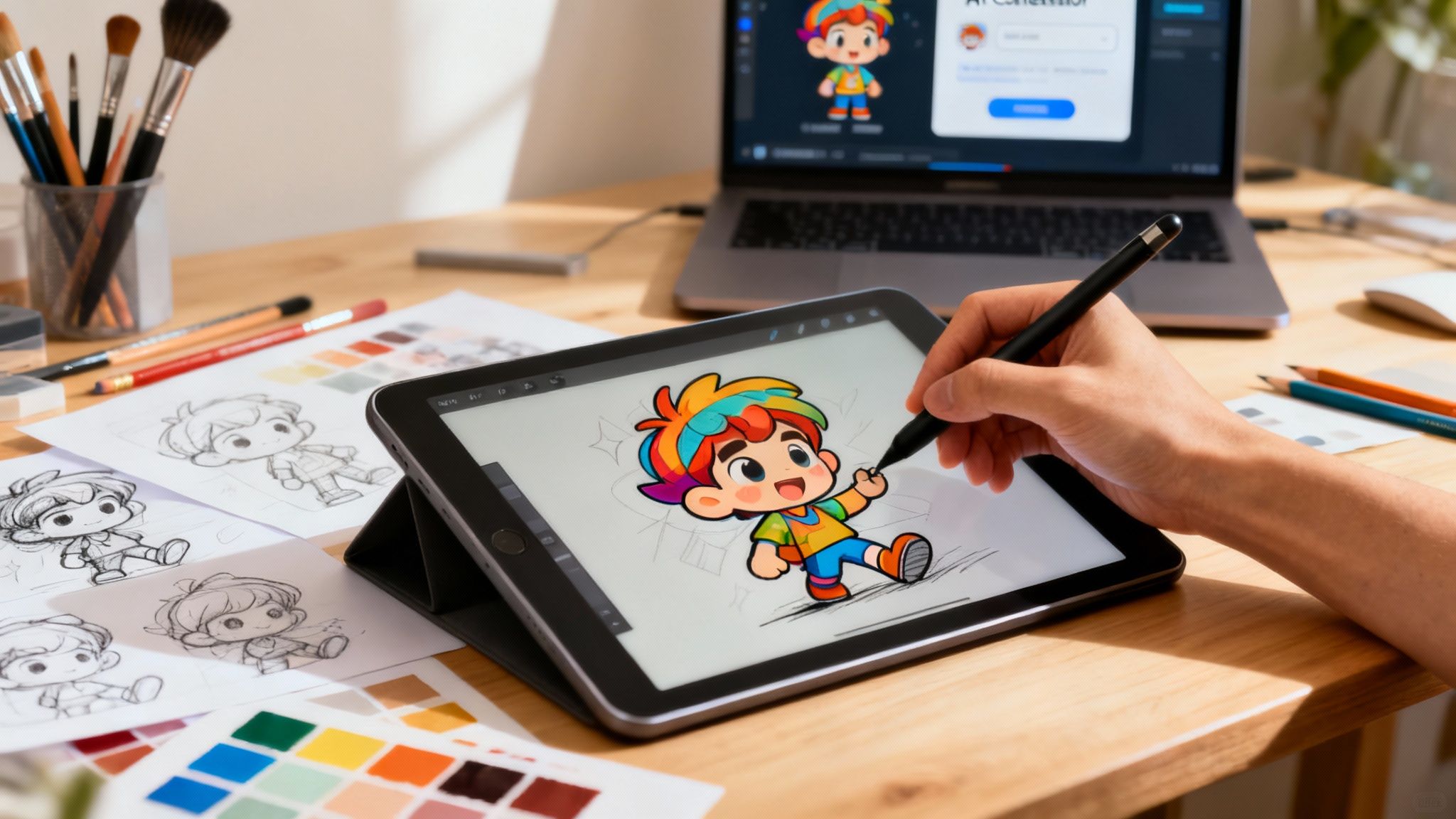
Ready to move from theory to execution? Media Workbench AI empowers you to generate compelling, context-aware CTAs and entire marketing campaigns in seconds. Stop guessing and start creating high-converting copy that drives action with our powerful AI tools. Try Media Workbench AI for free and see the difference it makes.